👉🏻 아래는 Dropdown Menu 부분입니다.
The section below is the dropdown menu.
👉🏻 레이아웃, 폰트사이즈나 대부분의 css,tailwindcss 내용은 이전 포스트의 내용과 거의 유사합니다.
The layout, font size, and most of the CSS and Tailwind CSS details are nearly identical to those in the previous post.
👉🏻 컴포넌트 형식으로 사용할수 있도록 ui디렉토리가 추가되었습니다.
A ui directory has been added to enable usage in component form.
📁 프로젝트 구조 / Project Structure
tailwindcss-nextjs/
└── app/
    ├── button-css/
    ├── button-tailwind/
    ├── card-css/
    ├── card-tailwind/
    ├── form-css/
    ├── form-tailwind/
    ├── dropdown-css/
    ├── dropdown-tailwind/
    └── ui/
        ├── page.tsx
        └── _components/
            ├── button.tsx
            └── dropdown.tsx
📁 Dropdown Menu – Tailwind & CSS
✔️ Tailwind
— 스크린 샷 / Screen Shoot
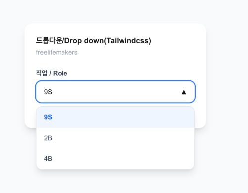
— http://localhost:3000/dropdown-tailwind
'use client'
import { useState } from 'react'

const OPTIONS = [
  { value: '9s', label: '9S' },
  { value: '2b', label: '2B' },
  { value: '4b', label: '4B' },
]

export default function Page() {
  const [open, setOpen] = useState(false)
  const [value, setValue] = useState(OPTIONS[0])

  return (
    <main className="min-h-screen flex items-center justify-center bg-gray-50 p-4">
      <div className="w-full max-w-sm bg-white rounded-2xl shadow-lg p-6">
        <h2 className="text-base font-bold">드롭다운/Drop down(Tailwindcss)</h2>
        <p className="text-sm text-gray-400 mt-1">freelifemakers</p>

        <div className="mt-6 flex flex-col gap-1.5">
          <label className="text-sm font-bold text-gray-700">직업 / Role</label>

          {/* Select */}
          <div className="relative">
            {/* 1. 버튼 - 항상 보이는 부분 / Button - Always visible part */}
            <button
              onClick={() => setOpen(!open)}
              className="w-full flex items-center justify-between px-4 py-3 bg-gray-50 border border-gray-200 rounded-xl text-sm text-left focus:outline-none focus:ring-2 focus:ring-blue-500 focus:bg-white transition-all"
            >
              <span>{value.label}</span>
              <span className={`transition-transform ${open? 'rotate-180' : ''}`}>▼</span>
            </button>

            {/* 2. 리스트 - open일 때만 보이는 부분 / List – section visible only when open */}
            {open && (
              <div className="absolute z-10 mt-2 w-full bg-white border border-gray-200 rounded-xl shadow-lg overflow-hidden">
                {OPTIONS.map((opt) => (
                  <button
                    key={opt.value}
                    onClick={() => {
                      setValue(opt)
                      setOpen(false)
                    }}
                    className={`w-full text-left px-4 py-3 text-sm hover:bg-gray-50 transition-colors ${
                      value.value === opt.value? 'bg-blue-50 text-blue-600 font-bold' : 'text-gray-700'
                    }`}
                  >
                    {opt.label}
                  </button>
                ))}
              </div>
            )}
          </div>

          <p className="text-xs text-gray-400 mt-2">선택된 값/Selected Value : {value.value}</p>
        </div>
      </div>
    </main>
  )
}
✔️ CSS
— 스크린 샷 / ScreenShot
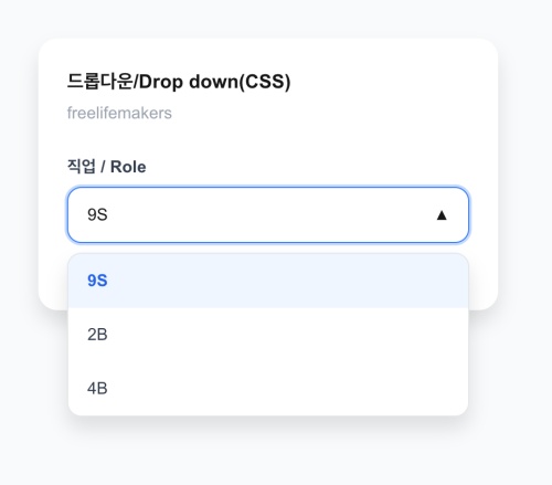
— http://localhost:3000/dropdown-css
'use client'
import { useState } from 'react'

const OPTIONS = [
  { value: '9s', label: '9S' },
  { value: '2b', label: '2B' },
  { value: '4b', label: '4B' },
]

export default function Page() {
  const [open, setOpen] = useState(false)
  const [value, setValue] = useState(OPTIONS[0])

  return (
    <>
      <main className="page">
        <div className="card">
          <h2 className="title">드롭다운/Drop down(CSS)</h2>
          <p className="subtitle">freelifemakers</p>

          <div className="field-group">
            <label className="label">직업 / Role</label>

            {/* Select 본체 - relative 기준점 */}
            <div className="select-wrap">
              {/* 1. 버튼 */}
              <button
                onClick={() => setOpen(!open)}
                className="select-btn"
              >
                <span>{value.label}</span>
                <span className={`arrow ${open? 'arrow-open' : ''}`}>▼</span>
              </button>

              {/* 2. 리스트 */}
              {open && (
                <div className="select-list">
                  {OPTIONS.map((opt) => (
                    <button
                      key={opt.value}
                      onClick={() => {
                        setValue(opt)
                        setOpen(false)
                      }}
                      className={`select-option ${value.value === opt.value? 'selected' : ''}`}
                    >
                      {opt.label}
                    </button>
                  ))}
                </div>
              )}
            </div>

            <p className="hint">선택된 값/Selected Value : {value.value}</p>
          </div>
        </div>
      </main>

      <style>{`
       .page {
          min-height: 100vh;
          display: flex;
          align-items: center;
          justify-content: center;
          background: #f9fafb;
          padding: 16px;
        }
       .card {
          width: 100%;
          max-width: 384px;
          background: white;
          border-radius: 16px;
          box-shadow: 0 10px 15px rgba(0,0,0,0.1);
          padding: 24px;
        }
       .title { font-size: 16px; font-weight: 700; }
       .subtitle { font-size: 14px; color: #9ca3af; margin-top: 4px; }

       .field-group {
          margin-top: 24px;
          display: flex;
          flex-direction: column;
          gap: 6px;
        }
       .label {
          font-size: 14px;
          font-weight: 700;
          color: #374151;
        }
       .hint {
          font-size: 12px;
          color: #9ca3af;
          margin-top: 8px;
        }

        /* Dropdown 기준점 / benchmark - relative */
       .select-wrap {
          position: relative;
        }

        /* 1. 버튼 / button- w-full flex justify-between */
       .select-btn {
          width: 100%;
          display: flex;
          align-items: center;
          justify-content: space-between;
          padding: 12px 16px;
          background: #f9fafb;
          border: 1px solid #e5e7eb;
          border-radius: 12px;
          font-size: 14px;
          text-align: left;
          cursor: pointer;
          transition: all 0.15s;
        }
       .select-btn:focus {
          outline: none;
          background: white;
          border-color: #3b82f6;
          box-shadow: 0 0 0 2px rgba(59,130,246,0.3);
        }

        /* 화살표 회전 / Rotate arrow */
       .arrow {
          transition: transform 0.2s;
          font-size: 12px;
        }
       .arrow-open {
          transform: rotate(180deg);
        }

        /* 2. 리스트 / List - absolute z-10 mt-2 */
       .select-list {
          position: absolute;
          z-index: 10;
          margin-top: 8px;
          width: 100%;
          background: white;
          border: 1px solid #e5e7eb;
          border-radius: 12px;
          box-shadow: 0 10px 15px rgba(0,0,0,0.1);
          overflow: hidden;
        }

        /* 옵션 하나 / One option */
       .select-option {
          width: 100%;
          text-align: left;
          padding: 12px 16px;
          font-size: 14px;
          border: none;
          background: white;
          color: #374151;
          cursor: pointer;
          transition: background 0.15s;
        }
       .select-option:hover {
          background: #f9fafb;
        }
       .select-option.selected {
          background: #eff6ff;
          color: #2563eb;
          font-weight: 700;
        }
      `}</style>
    </>
  )
}
📁 컴포넌트 형식으로 사용하기 / Using as a component
— 스크린 샷 / ScreenShot
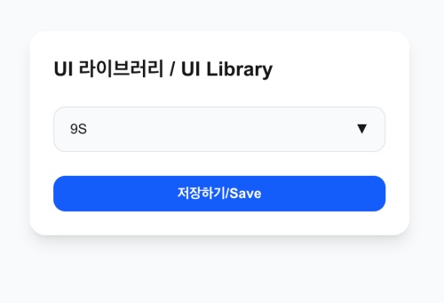
— http://localhost:3000/ui
✔️ 현재 버튼과 드롭다운 메뉴가 _compoents에 있습니다.(button.tsx dropdown.tsx)
Currently, the button and dropdown menu are located in _components (button.tsx, dropdown.tsx).
✔️ app/ui/page.tsx에서 사용시 아래처럼 사용합니다.
When using it in app/ui/page.tsx, use it as shown below.
// compoents
import { Button }  from './_components/button'
import { Dropdown } from './_components/dropdown';

export default function UIPage() {
  return (
    <main className="min-h-screen flex items-center justify-center bg-gray-50 p-4">
      <div className="w-full max-w-sm bg-white rounded-2xl shadow-lg p-6 flex flex-col gap-6">
        <h1 className="text-xl font-bold">내 UI 라이브러리 / </h1>

        <Dropdown />
        <Button>저장하기/Save</Button>
      </div>
    </main>
  )
}
마태복음 21장 22절 / Matthew 21: 22
“너희가 기도할 때에 무엇이든지 믿고 구하는 것은 다 받으리라 하시니라”
“And everything you ask in prayer, believing, you will receive.”


