1.react-native-freelifemakers-ui NPM 모듈 설치하기 / react-native-freelifemakers-ui NPM Module Instal
npm install react-native-freelifemakers-ui2.사용하기 / Usage
import {FlmTextInput, FlmText} from 'react-native-freelifemakers-ui';— 세개의 라디오 버튼을 사용하는 기본 코드는 아래와 같이 작성합니다.
The basic code using three radio buttons is written as follows:
          <FlmRadio
            label="과일을 선택하세요(세로출력)/Select fruit (vertical output):"
            options={[
              { label: "사과/apple", value: "apple" },
              { label: "바나나/banana", value: "banana" },
              { label: "포도/grape", value: "grape" },
            ]}
            initialValue="apple"
            onValueChange={setSelected}
          />
3.예제코드 / Example code
-아래는 Expo에서 실행가능한 코드 예제 입니다.
Below is an example of code that can be run on Expo.
import React, { useState } from "react";
import { View, Text, StyleSheet, ScrollView, SafeAreaView } from "react-native"; // ScrollView, SafeAreaView
import { FlmRadio, FlmText } from "react-native-freelifemakers-ui";
export default function App() {
// 기본 스타일 / default style
const [selected, setSelected] = useState("banana");
// 커스텀 스타일 / custom style
const [selectedFruit, setSelectedFruit] = useState("banana");
const [selectedColor, setSelectedColor] = useState(null);
const fruitOptions = [
{ label: "사과/apple", value: "apple" },
{ label: "바나나/banana", value: "banana" },
{ label: "포도/grape", value: "grape" },
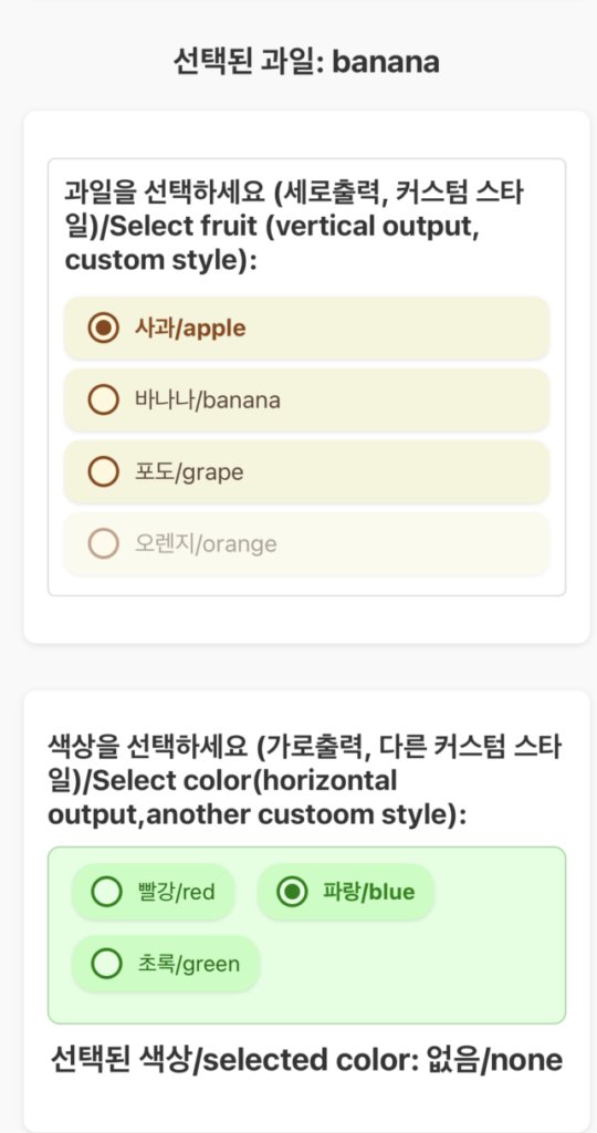
{ label: "오렌지/orange", value: "orange", disabled: true }, // 비활성화된 옵션/disabled option
];
const colorOptions = [
{ label: "빨강/red", value: "red" },
{ label: "파랑/blue", value: "blue" },
{ label: "초록/green", value: "green" },
];
return (
<SafeAreaView style={appStyles.safeArea}>
<ScrollView style={appStyles.scrollViewContent}>
{/* ScrollView 적용 / Apply ScrollView */}
{/* --기본 라디오 버튼/Default radio button-- */}
<View style={appStyles.defaultSection}>
<FlmText style={appStyles.defaultSectionText}>
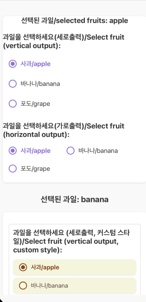
선택된 과일/selected fruits: {selected}
</FlmText>
<FlmRadio
label="과일을 선택하세요(세로출력)/Select fruit (vertical output):"
options={[
{ label: "사과/apple", value: "apple" },
{ label: "바나나/banana", value: "banana" },
{ label: "포도/grape", value: "grape" },
]}
initialValue="apple"
onValueChange={setSelected}
/>
<FlmRadio
label="과일을 선택하세요(가로출력)/Select fruit (horizontal output):"
options={[
{ label: "사과/apple", value: "apple" },
{ label: "바나나/banana", value: "banana" },
{ label: "포도/grape", value: "grape" },
]}
initialValue="apple"
onValueChange={setSelected}
direction="horizontal"
/>
</View>
{/* --커스텀 스타일 적용/Apply custom style-- */}
<View style={appStyles.container}>
<Text style={appStyles.header}>
선택된 과일/Selected Fruit: {selectedFruit}
</Text>
{/* 기본 세로 출력 라디오 버튼 (커스텀 스타일 적용) */}
{/* Default vertical output radio button (apply custom style) */}
<View style={appStyles.section}>
<FlmRadio
label="과일을 선택하세요 (세로출력, 커스텀 스타일)/Select fruit (vertical output, custom style):"
options={fruitOptions}
initialValue="apple"
onValueChange={setSelectedFruit}
direction="vertical"
radioGroupStyle={appStyles.customRadioGroup}
radioOptionStyle={appStyles.customRadioButton}
radioCircleWrapperStyle={appStyles.customCircleWrapper}
radioCircleStyle={appStyles.customCircle}
radioFilledCircleStyle={appStyles.customFilledCircle}
radioLabelStyle={appStyles.customLabel}
radioCheckedLabelStyle={appStyles.customCheckedLabel}
/>
</View>
{/* 가로 출력 라디오 버튼 (다른 커스텀 스타일 적용) */}
{/* Horizontal output radio button (Apply another custom style) */}
<View style={appStyles.section}>
<FlmRadio
label="색상을 선택하세요 (가로출력, 다른 커스텀 스타일)/Select color(horizontal output,another custoom style):"
options={colorOptions}
initialValue="blue"
onValueChange={setSelectedColor}
direction="horizontal"
optionContainerStyle={appStyles.customHorizontalContainer}
radioOptionStyle={appStyles.customHorizontalOption}
radioCircleWrapperStyle={appStyles.customHorizontalCircleWrapper}
radioFilledCircleStyle={appStyles.customHorizontalFilledCircle}
radioLabelStyle={appStyles.customHorizontalLabel}
radioCheckedLabelStyle={appStyles.customHorizontalCheckedLabel}
/>
<FlmText style={appStyles.header}>
선택된 색상/selected color: {selectedColor || "없음/none"}
</FlmText>
</View>
</View>
</ScrollView>
</SafeAreaView>
);
}
const appStyles = StyleSheet.create({
safeArea: {
flex: 1, // SafeAreaView가 전체 화면을 차지하도록 / Make SafeAreaView take up the entire screen
backgroundColor: "#f9f9f9",
},
scrollViewContent: {
padding: 20,
},
defaultSection: {
marginBottom: 30,
padding: 0,
backgroundColor: "#fff",
borderRadius: 8,
shadowColor: "#000",
shadowOffset: { width: 0, height: 1 },
shadowOpacity: 0.1,
shadowRadius: 2,
elevation: 2,
marginTop: 20,
},
defaultSectionText: {
fontSize: 18,
fontWeight: "bold",
marginBottom: 10,
color: "#333",
textAlign: "center",
},
container: {
// 기존 appStyles.container 대신 ScrollView가 padding을 가짐
// ScrollView has padding instead of existing appStyles.container
//
// flex: 1, ScrollView 내부에서는 flex: 1을 사용하지 않음
// Don't use flex: 1 inside ScrollView
//
// paddingTop: 50, ScrollView 또는 SafeAreaView에서 조절
// Controlling in ScrollView or SafeAreaView
},
header: {
fontSize: 20,
fontWeight: "bold",
marginBottom: 20,
color: "#333",
textAlign: "center",
},
section: {
marginBottom: 30,
padding: 15,
backgroundColor: "#fff",
borderRadius: 8,
shadowColor: "#000",
shadowOffset: { width: 0, height: 1 },
shadowOpacity: 0.1,
shadowRadius: 2,
elevation: 2,
},
// --- 커스텀 스타일 정의 / Custom style definistions ---
customRadioGroup: {
marginVertical: 15,
borderWidth: 1,
borderColor: "#ddd",
borderRadius: 5,
padding: 10,
},
customRadioButton: {
backgroundColor: "#F5F5DC",
borderRadius: 10,
marginVertical: 3,
shadowColor: "#000",
shadowOffset: { width: 0, height: 1 },
shadowOpacity: 0.1,
shadowRadius: 1,
elevation: 1,
},
customCircleWrapper: {
borderColor: "#8B4513", // 갈색 테두리 / brown border
backgroundColor: "#FFF8DC", // 밝은 베이지색 배경 / light beige background
},
customCircle: {
backgroundColor: "transparent",
},
customFilledCircle: {
backgroundColor: "#8B4513", // 갈색 채움 / brown fill
},
customLabel: {
color: "#5C4033", // 어두운 갈색 텍스트 / dark brown text
fontSize: 15,
},
customCheckedLabel: {
color: "#8B4513", // 선택되면 갈색 텍스트 / Brown text when selected
fontWeight: "bold",
},
// --- 가로 출력용 다른 커스텀 스타일 / Other custom styles for landscape printing ---
customHorizontalContainer: {
backgroundColor: "#e0ffe0", // 연한 초록색 배경 / light green background
padding: 10,
borderRadius: 8,
borderWidth: 1,
borderColor: "#a0daa0",
},
customHorizontalOption: {
backgroundColor: "#c0ffc0", // 더 연한 초록색 / lighter green
borderRadius: 15,
paddingVertical: 8,
paddingHorizontal: 12,
marginHorizontal: 5, // 가로 간격 / horizontal spacing
marginVertical: 5, // 세로 간격 / vertical spacing
shadowColor: "#000",
shadowOffset: { width: 0, height: 1 },
shadowOpacity: 0.1,
shadowRadius: 1,
elevation: 1,
},
customHorizontalCircleWrapper: {
borderColor: "#008000", // 진한 초록색 / dark green
backgroundColor: "#e0ffe0",
},
customHorizontalFilledCircle: {
backgroundColor: "#008000", // 진한 초록색 채움 / dark green fill
},
customHorizontalLabel: {
color: "#006400", // 어두운 초록색 텍스트 / dark green text
fontSize: 14,
},
customHorizontalCheckedLabel: {
color: "#008000", // 선택되면 진한 초록색 텍스트 / When selected, dark green text
fontWeight: "bold",
},
});
4.스크린샷 / ScreenShot
