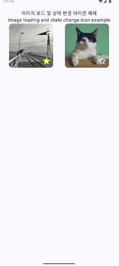
👉🏻 상태관리를 통해서 별 모양을 누르면 아이콘 모양이 바뀝니다.
When you click on the star shape through status management, the icon shape changes.
👉🏻 로컬 이미지와 네트워크 이미지를 사용합니다.
Use local and network images.
1.인터넷 사용권한 추가 / Add Internet access permission
✔️AndroidManifest.xml
<?xml version="1.0" encoding="utf-8"?>
<manifest xmlns:android="http://schemas.android.com/apk/res/android"
    xmlns:tools="http://schemas.android.com/tools">
    <!-- 인터넷 사용권한 추가 / Add Internet access permission -->
    <uses-permission android:name="android.permission.INTERNET" />
    <application
        android:allowBackup="true"
        android:dataExtractionRules="@xml/data_extraction_rules"
        android:fullBackupContent="@xml/backup_rules"
        android:icon="@mipmap/ic_launcher"
        android:label="@string/app_name"
        android:roundIcon="@mipmap/ic_launcher_round"
        android:supportsRtl="true"
        android:theme="@style/Theme.ImageState">
        <activity
            android:name=".MainActivity"
            android:exported="true"
            android:label="@string/app_name"
            android:theme="@style/Theme.ImageState">
            <intent-filter>
                <action android:name="android.intent.action.MAIN" />

                <category android:name="android.intent.category.LAUNCHER" />
            </intent-filter>
        </activity>
    </application>

</manifest>
2.라이브러리 추가 / Add library
✔️build.gradle.kts
dependencies {
    implementation(libs.androidx.core.ktx)
    implementation(libs.androidx.lifecycle.runtime.ktx)
    implementation(libs.androidx.activity.compose)
    implementation(platform(libs.androidx.compose.bom))
    implementation(libs.androidx.compose.ui)
    implementation(libs.androidx.compose.ui.graphics)
    implementation(libs.androidx.compose.ui.tooling.preview)
    implementation(libs.androidx.compose.material3)
    testImplementation(libs.junit)
    androidTestImplementation(libs.androidx.junit)
    androidTestImplementation(libs.androidx.espresso.core)
    androidTestImplementation(platform(libs.androidx.compose.bom))
    androidTestImplementation(libs.androidx.compose.ui.test.junit4)
    debugImplementation(libs.androidx.compose.ui.tooling)
    debugImplementation(libs.androidx.compose.ui.test.manifest)

    // Coil Compose 통합 라이브러리 추가(인터넷 이미지 불러오기)
    // Add Coil Compose integration library (loading internet images)
    implementation("io.coil-kt:coil-compose:2.6.0")
    // 아이콘 사용 / Use icons
    implementation("androidx.compose.material:material-icons-extended")
}
3.로컬 이미지 넣기 / Insert local image
✔️ res/drawble/cat.jpg
— 안드로이드스튜디오의 프로젝트 창에 이미지를 끌어다 놓으면 됩니다.
Just drag and drop the image into the project window in Android Studio.
4.소스코드 / Source Code
✔️ MainActivity.kts
package com.freelifemakers.imagestate

import android.os.Bundle
import androidx.activity.ComponentActivity
import androidx.activity.compose.setContent
import androidx.activity.enableEdgeToEdge
import androidx.compose.foundation.Image
import androidx.compose.foundation.clickable
import androidx.compose.foundation.layout.Arrangement
import androidx.compose.foundation.layout.Box
import androidx.compose.foundation.layout.Column
import androidx.compose.foundation.layout.Row
import androidx.compose.foundation.layout.fillMaxSize
import androidx.compose.foundation.layout.fillMaxWidth
import androidx.compose.foundation.layout.height
import androidx.compose.foundation.layout.padding
import androidx.compose.foundation.layout.size
import androidx.compose.foundation.layout.width
import androidx.compose.material.icons.Icons
import androidx.compose.material.icons.filled.Add
import androidx.compose.material.icons.filled.Done
import androidx.compose.material.icons.filled.Favorite
import androidx.compose.material.icons.filled.FavoriteBorder
import androidx.compose.material.icons.filled.Star
import androidx.compose.material.icons.filled.StarBorder
import androidx.compose.material3.Card
import androidx.compose.material3.Icon
import androidx.compose.material3.MaterialTheme
import androidx.compose.material3.Scaffold
import androidx.compose.material3.Text
import androidx.compose.runtime.Composable
import androidx.compose.runtime.getValue
import androidx.compose.runtime.mutableStateOf
import androidx.compose.runtime.remember
import androidx.compose.runtime.saveable.rememberSaveable
import androidx.compose.runtime.setValue
import androidx.compose.ui.Alignment
import androidx.compose.ui.Modifier
import androidx.compose.ui.graphics.Color
import androidx.compose.ui.layout.ContentScale
import androidx.compose.ui.res.painterResource
import androidx.compose.ui.text.style.TextAlign
import androidx.compose.ui.tooling.preview.Preview
import androidx.compose.ui.unit.dp
import coil.compose.AsyncImage
import com.freelifemakers.imagestate.ui.theme.ImageStateTheme


// 네트워크 이미지 URL / Network Image URL
const val DummyImageUrl = "https://picsum.photos/300/300"

class MainActivity : ComponentActivity() {
    override fun onCreate(savedInstanceState: Bundle?) {
        super.onCreate(savedInstanceState)
        enableEdgeToEdge()
        setContent {
            ImageStateTheme {
                MainAppScreen() // 앱 실행 / Run App
            }
        }
    }
}


// 메인스크린 / Main Screen
@Composable
fun MainAppScreen() {
    Scaffold(modifier = Modifier.fillMaxSize()) { innerPadding ->
        // innerPadding을 적용하여 안전 영역을 확보합니다.
        Column(modifier = Modifier.padding(innerPadding)) {
            ImageLoadingExample() //<-- ImageWithToggleIcon
        }
    }
}

// 이미지 불러오기,상태관리,클릭시 아이콘 전환
// Image loading, state management, icon switching on click
@Composable
fun ImageWithToggleIcon(
    imageContent: @Composable () -> Unit,
    modifier: Modifier = Modifier
) {
    // 상태 관리 rememberSaveable, mutableStateOf를 사용
    // 그냥 remember를 사용 할 경우 모바일 폰 회전시 초기화 됨.
    // Use rememberSaveable and mutableStateOf for state management.
    // If you just use remember, it will be initialized when the phone is rotated.
    var isFavorite by rememberSaveable { mutableStateOf(false) }

    // Box를 사용하여 이미지와 아이콘을 겹쳐서 배치
    // Use Box to place images and icons in an overlapping manner
    Box(
        modifier = modifier
            .size(150.dp)
    ) {
        // 이미지 불러오기 컴포즈(AsyncImage 또는 Local Image)
        // Load image compose (AsyncImage or Local Image)
        imageContent()

        // 클릭 가능한 아이콘 / clickable icon
        Icon(
            imageVector = if (isFavorite) Icons.Filled.Star else Icons.Filled.StarBorder,
            contentDescription = "좋아요 버튼",
            tint = if (isFavorite) Color.Yellow else Color.White,
            modifier = Modifier
                .align(Alignment.BottomEnd) // 우측 하단에 배치 / Placed in the bottom right
                .padding(8.dp)
                .size(30.dp)
                .clickable {
                    // 클릭 시 상태를 반전 (아이콘 변경)
                    // Invert the state when clicked (change icon)
                    isFavorite = !isFavorite
                }
        )
    }
}

// == 텍스트 배치 ,좌측우측 이미지 및 아이콘 배치 ==
// == Text placement, left and right image and icon placement ==
@Composable
fun ImageLoadingExample() {
    Column(modifier = Modifier.padding(16.dp)) {

        Text(
            text = "이미지 로드 및 상태 변경 아이콘 예제",
            modifier = Modifier.fillMaxWidth(),
            textAlign = TextAlign.Center
        )
        Text(
            text = "Image loading and state change icon example",
            modifier = Modifier.fillMaxWidth(),
            textAlign = TextAlign.Center
        )

        Row(
            modifier = Modifier
                        .fillMaxWidth()
                        .align(Alignment.CenterHorizontally),
            horizontalArrangement = Arrangement.SpaceAround ,// 이미지 사이 공간 확보 / Leave space between images

        ) {

            // ===  좌측 이미지 / left image: AsyncImage (네트워크/Network)  ===

            Card(
                modifier = Modifier
                    //.weight(1f)
                    .padding(end = 0.dp)
                    .size(150.dp)


            ) {
                Box(
                    modifier = Modifier,
                    contentAlignment = Alignment.Center
                ) {
                    // 이미지와 토글 아이콘 블러오기
                    // Blur the image and toggle icon
                    ImageWithToggleIcon(
                        imageContent = {

                            AsyncImage(
                                model = DummyImageUrl,
                                contentDescription = "네트워크에서 불러온 이미지",
                                contentScale = ContentScale.Crop,
                                modifier = Modifier.fillMaxSize()
                            )
                        }
                    )
                }
            }


            // ===  우측 이미지 / right image: Image (로컬 리소스 / local resource)  ===

            Card(
                modifier = Modifier
                   // .weight(1f)
                    .padding(start = 0.dp)
                    .size(150.dp)

            ) {
                Box(
                    modifier = Modifier,
                    contentAlignment = Alignment.Center
                ) {
                    ImageWithToggleIcon(
                        imageContent = {
                            Image(
                                painter = painterResource(id = R.drawable.cat),
                                contentDescription = "로컬이미지/Local Image",
                                contentScale = ContentScale.Crop,
                                modifier = Modifier.fillMaxSize()
                            )
                        }
                    )
                }
            }
        }
    }
}


// == 기존 코드 / existing code ==
@Composable
fun Greeting(name: String, modifier: Modifier = Modifier) {
    Text(
        text = "Hello $name!",
        modifier = modifier
    )
}

@Preview(showBackground = true)
@Composable
fun GreetingPreview() {
    ImageStateTheme {
        //Greeting("Android")
        ImageLoadingExample()
    }
}
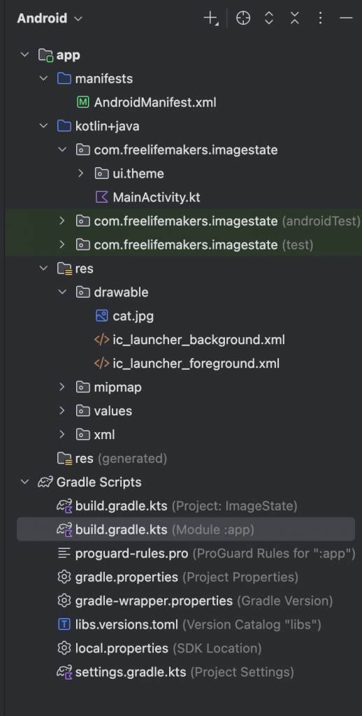
5.스크린샷 / ScreenShot
✔️ 좌측은 스크린샷이고 우측은 안드로이드 스튜디오의 프로젝트창 입니다.
On the left is a screenshot and on the right is the project window in Android Studio.
