👉🏻 JetpackCompose는 기존의 xml방식과는 다르게 코틀린 코드로 UI디자인을 구성합니다.
JetpackCompose composes UI designs using Kotlin code, unlike the traditional XML method.
👉🏻 @Compose 어노테이션이 붙어 있는 함수를 컴포즈라고 합니다.
A function annotated with @Compose is called a compose.
👉🏻 이 컴포즈를 setContent {} 내에서 실행합니다.
Run this compose inside setContent {}.
👉🏻 아래 코드는 기본 레이아웃에 대한 코드 입니다.
The code below is for the basic layout.
👉🏻 나머지 설명은 코드 주석을 참조하세요
Please refer to the code comments for the rest of the explanation.
package com.freelifemakers.jetpackexample1
import android.os.Bundle
import androidx.activity.ComponentActivity
import androidx.activity.compose.setContent
import androidx.activity.enableEdgeToEdge
import androidx.compose.foundation.background
import androidx.compose.foundation.layout.Arrangement
import androidx.compose.foundation.layout.Box
import androidx.compose.foundation.layout.Column
import androidx.compose.foundation.layout.Row
import androidx.compose.foundation.layout.Spacer
import androidx.compose.foundation.layout.fillMaxSize
import androidx.compose.foundation.layout.padding
import androidx.compose.material3.Scaffold
import androidx.compose.material3.Text
import androidx.compose.runtime.Composable
import androidx.compose.ui.Modifier
import androidx.compose.ui.tooling.preview.Preview
import com.freelifemakers.jetpackexample1.ui.theme.JetPackExample1Theme
import androidx.compose.ui.Alignment // Alignment import 추가
import androidx.compose.material3.TextField // add
import androidx.compose.foundation.layout.fillMaxWidth // add
import androidx.compose.foundation.layout.height
import androidx.compose.foundation.layout.heightIn // add
import androidx.compose.ui.graphics.Color // add
import androidx.compose.foundation.layout.size
import androidx.compose.foundation.rememberScrollState
import androidx.compose.foundation.verticalScroll
import androidx.compose.ui.text.style.TextAlign
import androidx.compose.ui.unit.TextUnit
import androidx.compose.ui.unit.dp
import androidx.compose.ui.unit.sp
/*----------------------------------------------------------
* -컴포즈/Compose
* 함수에 @Composable 어노테이션이 붙은것은 컴포즈로 사용할 수 있음.
*
* -레이아웃
* 컬럼,로우(스크롤 적용)
*
* - Modifier
* Jetpack Compose에서 Modifier는 컴포저블 함수를 꾸미거나
* 기능을 추가하는 데 사용되는 필수 요소.
* XML 레이아웃에서의 속성(Attribute)과 비슷한 역할을 하지만, 훨씬 더 유연하고 강력함.
*
*
* - Compose
* Functions annotated with @Composable can be used with Compose.
*
* - Layout
* Columns, Rows (scrolling)
*
* - Modifier
* In Jetpack Compose, modifiers are essential elements used to decorate composable functions or add functionality.
* They function similarly to attributes in XML layouts,
* but are much more flexible and powerful.
*
*
* -------------------------------------------------------------*/
class MainActivity : ComponentActivity() {
override fun onCreate(savedInstanceState: Bundle?) {
super.onCreate(savedInstanceState)
enableEdgeToEdge()
setContent {
JetPackExample1Theme {
Scaffold(modifier = Modifier.fillMaxSize()) { innerPadding ->
// 스크롤 상태는 Column 바깥에서 선언
// Scroll state is declared outside the column
val scrollState = rememberScrollState()
Column(
modifier = Modifier
.fillMaxSize()
.verticalScroll(scrollState) // 컬럼에 스크롤 / scroll to column
.padding(innerPadding)
){
// Welcome Message-default
Greeting(
name = "Android",
modifier = Modifier.padding(innerPadding)
)
// Column Layout
ColumnScrollExample(
modifier = Modifier.padding(innerPadding)
)
// Row Layout
RowLayoutExample(
modifier = Modifier.padding(innerPadding)
)
// Column Layout
ColumnLayoutExample(
modifier = Modifier.padding(innerPadding)
)
// Box Layout
TextExample("Box Alignment Example", fontSizeParam = 30.sp)
BoxAlignmentExample()
Spacer(modifier = Modifier.height(30.dp))
TextExample("Box Layering Example", fontSizeParam = 30.sp)
BoxLayeringExample()
}
}
}
}
}
}
// === 컴포즈 영역 / Compose area ===
@Composable
fun Greeting(name: String, modifier: Modifier = Modifier) {
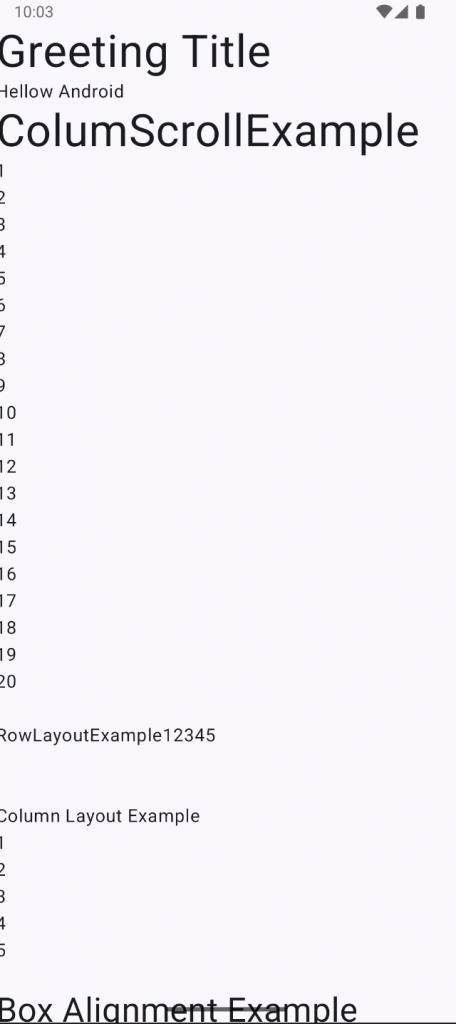
TextExample("Greeting Title")
Text("Hellow $name")
}
@Composable
fun ColumnScrollExample(modifier: Modifier = Modifier) {
val scrollState = rememberScrollState()
Column(
) {
TextExample("ColumScrollExample")
for (i: Int in 1..20) {
Text("$i")
}
}
}
@Composable
fun ColumnLayoutExample(modifier: Modifier) {
Column(
modifier = modifier,
/* verticalArrangement: Arrangement.Vertical
* Arrangement.Top (기본값)
* Arrangement.Center
* Arrangement.Bottom
* Arrangement.SpaceEvenly
* Arrangement.SpaceAround
* Arrangement.SpaceBetween
*/
verticalArrangement = Arrangement.Top,
/* horizontalAlignment: Alignment.Horizontal
* Alignment.Start (기본값)
* Alignment.CenterHorizontally
* Alignment.End
*/
horizontalAlignment = Alignment.Start
) {
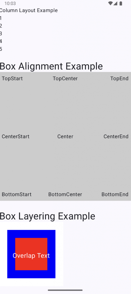
Text("Column Layout Example")
Text("1")
Text("2")
Text("3")
Text("4")
Text("5")
}
}
@Composable
fun RowLayoutExample(modifier: Modifier = Modifier) {
Row (
modifier = modifier,
/* horizontalArrangement: Arrangement.Horizontal
* Arrangement.Start (기본값)
* Arrangement.Center
* Arrangement.End
* Arrangement.SpaceEvenly
* Arrangement.SpaceAround
* Arrangement.SpaceBetween
*/
horizontalArrangement = Arrangement.Start,
/* verticalAlignment: Alignment.Vertical
* Alignment.Top (기본값)
* Alignment.CenterVertically
* Alignment.Bottom
*/
verticalAlignment = Alignment.Top
){
Text("RowLayoutExample")
Text("1")
Text("2")
Text("3")
Text("4")
Text("5")
}
}
@Composable
fun BoxAlignmentExample() {
// 텍스트가 겹치지 않도록 Box에 충분한 크기 확보.
// Make sure the Box is large enough to avoid overlapping text.
Box(
modifier = Modifier
.fillMaxWidth() // 가로를 최대로 채우기 / Fill the width to the maximum
.height(400.dp) // 고정된 높이 지정 / Specify a fixed height
.background(Color.LightGray) // Box의 영역에 경색 추가 / Add a hard border to the box area
.padding(8.dp) // Box 내부의 여백 / Margin inside the box
) {
val fontSize = 16.sp
// Modifier.align()를 사용하여 Box 내부의 위치를 지정합니다.
// Use Modifier.align() to position it inside the Box.
Text(
text = "TopStart",
modifier = Modifier.align(Alignment.TopStart),
fontSize = fontSize
)
Text(
text = "TopCenter",
modifier = Modifier.align(Alignment.TopCenter),
fontSize = fontSize
)
Text(
text = "TopEnd",
modifier = Modifier.align(Alignment.TopEnd),
fontSize = fontSize
)
Text(
text = "CenterStart",
modifier = Modifier.align(Alignment.CenterStart),
fontSize = fontSize
)
Text(
text = "Center",
modifier = Modifier.align(Alignment.Center),
fontSize = fontSize,
textAlign = TextAlign.Center
)
Text(
text = "CenterEnd",
modifier = Modifier.align(Alignment.CenterEnd),
fontSize = fontSize
)
Text(
text = "BottomStart",
modifier = Modifier.align(Alignment.BottomStart),
fontSize = fontSize
)
Text(
text = "BottomCenter",
modifier = Modifier.align(Alignment.BottomCenter),
fontSize = fontSize
)
Text(
text = "BottomEnd",
modifier = Modifier.align(Alignment.BottomEnd),
fontSize = fontSize
)
}
}
@Composable
fun BoxLayeringExample() {
Box(
modifier = Modifier
.size(200.dp) // 크기 지정 / Specify size
.background(Color.White) // 배경색 / Background Color
) {
// 가장 아래 깔리는 요소 (큰 사각형)
// The bottommost element (large square)
Spacer(
modifier = Modifier
.size(150.dp)
.align(Alignment.Center) // 중앙 정렬 / center alignment
.background(Color.Blue)
)
// 겹쳐지는 요소 (작은 사각형)
// Overlapping elements (small squares)
Spacer(
modifier = Modifier
.size(100.dp)
.align(Alignment.Center)
.background(Color.Red)
)
// 가장 위에 표시되는 요소 (텍스트)
// The topmost element (text)
Text(
text = "Overlap Text",
color = Color.White,
fontSize = 20.sp,
modifier = Modifier
.align(Alignment.Center)
.padding(top = 10.dp)
)
}
}
@Composable
fun TextExample(
name: String,
modifier: Modifier = Modifier,
fontSizeParam: TextUnit = 40.sp
) {
Text(
text = "$name",
modifier = modifier,
fontSize = fontSizeParam,
textAlign = TextAlign.Center
)
}
// === 프리뷰 영역 / Preview Area===
// @Composable 함수에는 @Preview를 달 수 있다.
@Preview(showBackground = true)
@Composable
fun GreetingWithDefaultParameter(name: String = "Default Parameter") {
Text(
text = "Hello world!"
)
}
@Preview(showBackground = true)
@Composable
fun GreetingWithNoParameter() {
Text(
text = "Hello MyApp"
)
}
@Preview(showBackground = true)
@Composable
fun GreetingPreview() {
JetPackExample1Theme {
Greeting("Android")
}
}
스크린 샷 / Screen Shot
