👉🏻 카드는 웹 앱이나 모바일 앱에서 매우 많이 쓰이는 요소입니다.
Cards are a widely used element in web and mobile apps.
👉🏻 데이터를 화면에 표시할 때 카드 요소에 데이터를 담아 화면에 표현하는 경우가 매우 많습니다.
When displaying data on the screen, it is very common to present it using card elements.
👉🏻 tailwind는 아래의 웹사이트의 검색을 통해서 자세한 내용을 확인 할 수 있습니다.
You can find detailed information about Tailwind by searching on the website below.
https://tailwindcss.com/docs/installation/using-vite
👉🏻 전체 코드는 깃허브에서 확인 할 수 있습니다.
You can find the full code on GitHub.
https://github.com/gideonslife01/flm-webui
📁 타입스크립트 / Typescript
✔️ page.tsx는 타입스크립트를 사용합니다.
page.tsx uses TypeScript.
✔️ 만약에 에디터로 코드 오픈시 태그 부분에 빨간 줄이 생기면 아래처럼 모듈을 설치합니다.
If a red line appears under the tag section when opening the code in the editor, install the module as shown below.
✔️ vscode나 에디터가 타입스크립트를 인식할 수 있게 다음처럼 설치합니다.
Install the following so that VS Code or your editor can recognize TypeScript.
npm install -D @types/react @types/node📁 태그 구조 / Tag structure
✔️ 카드 부분의 HTML기본 구조는 아래와 같습니다.
The basic HTML structure for the card section is as follows.
✔️ 여기서 중요하게봐야하는건 각 요소(div,p,button…)들의 배치 부분입니다.
The key aspect to focus on here is the layout of the individual elements (div, p, button, etc.).
    <main className="min-h-screen flex items-center justify-center bg-gray-50 p-4">

      {/* 카드 시작 / Start Card */}
      <div className="w-full max-w-sm bg-white rounded-2xl shadow-lg overflow-hidden">

        {/* 이미지 영역 / Image Area */}
        <div className="h-48 bg-gradient-to-br from-blue-400 to-purple-500 flex items-center justify-center">
          <span className="text-5xl">🚀</span>
        </div>

        {/* 텍스트 영역 / Text area */}
        <div className="p-6">
          <div className="flex items-center justify-between">
            <h2 className="text-xl font-bold text-gray-900">Freelifemakers</h2>
            <span className="px-2 py-1 text-xs font-bold bg-blue-100 text-blue-600 rounded-full">NEW</span>
          </div>
          <p className="mt-2 text-sm text-gray-400">
            Next.js + Tailwind로 만든 소개 카드입니다.<br></br>
            This is an introductory card built with Next.js and Tailwind.
          </p>

          {/* 버튼 / Button */}
          <div className="mt-6 flex gap-3">
            <button
              onClick={() => setLiked(!liked)}
              className={`flex-1 py-3 rounded-xl font-bold transition-all active:scale-95 ${liked ? 'bg-red-500 text-white' : 'bg-gray-100 text-gray-700 hover:bg-gray-200'}`}
            >
              {liked ? '❤️ 좋아요/like' : '🤍 좋아요/like'}
            </button>
            <button className="flex-1 py-3 bg-blue-500 text-white rounded-xl font-bold shadow-md hover:bg-blue-600 hover:-translate-y-0.5 transition-all active:scale-95">
              시작하기 / Start
            </button>
          </div>

        </div>
      </div>
      {/* 카드 끝 / card end */}
    </main>
📁 가로배치 / Horizontal layout
✔️ 각 요소들은 기본적으로 세로로 배치됩니다.
Each element is arranged vertically by default.
✔️ 요소들의 배치를 코드로 조정하려면 flex를 사용합니다.
Use flex to adjust the layout of elements via code.
✔️ 카드가 시작되는 부분에 flex를 사용하지 않은 경우입니다. 이 경우 기본 값으로 각 요소는 세로로 배치됩니다.
This is a case where flex is not used at the start of the card. In this instance, the elements are arranged vertically by default.
      {/* 카드 시작 / Start Card */}
      <div className="w-full max-w-sm bg-white rounded-2xl shadow-lg overflow-hidden">
              ... ...
      </div>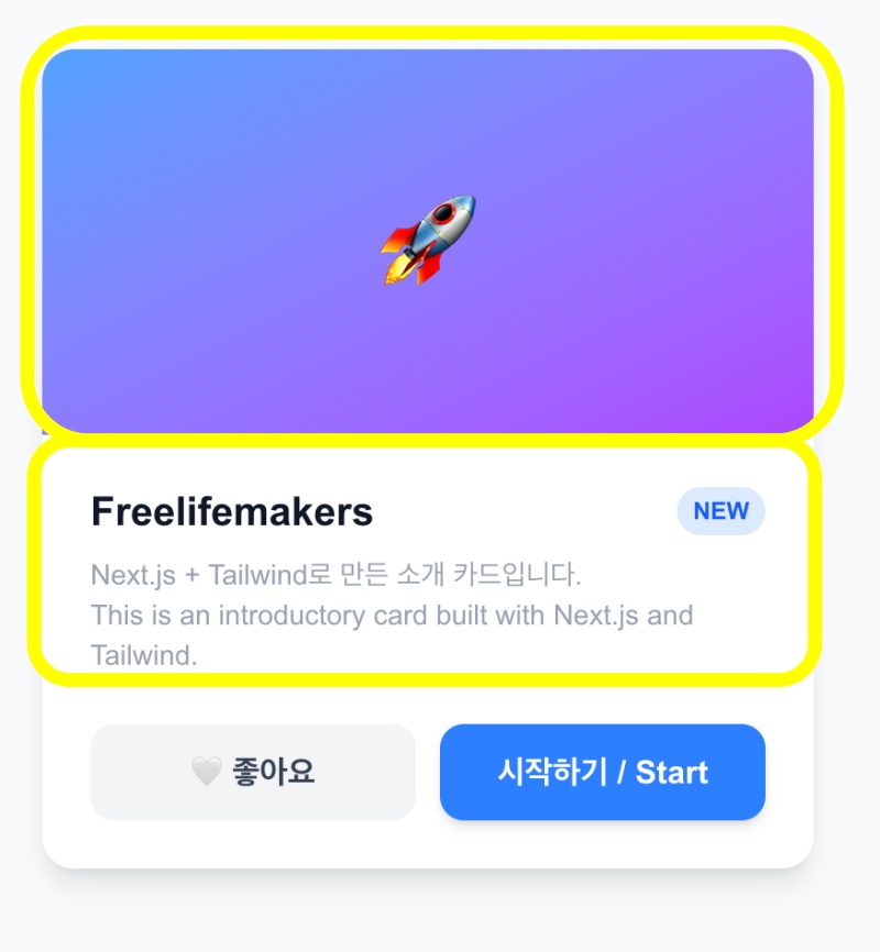
✔️ flex를 사용한 경우입니다. 이 경우 이미지와 텍스트가 가로 배치되는 것을 볼 수 있습니다.
      {/* 카드 시작 / Start Card */}
      <div className="w-full flex max-w-sm bg-white rounded-2xl shadow-lg overflow-hidden">
              ... ...
      </div>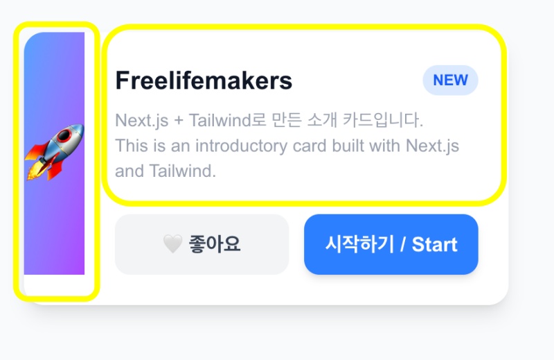
📁 세로배치 / Vertical layout
✔️ 기본값은 세로 배치지만 정렬기능을 사용하기 위해서 flex-col를 사용합니다.
✔️ 아래처럼 버튼 부분에 아래 처럼 flex-1로 적용하고 <div className=”mt-6 flex gap-3″> 이렇게 적용하면 레이아웃이 깨질 수 있습니다.
✔️ flex-1 가로 모드에서 아이템이 차지하는 공간이 1:1 비율로 배치하는 코드입니다.
 <button
       onClick={() => setLiked(!liked)}
       className={`flex-1 py-3 rounded-xl ... ... > ... ... </button>
✔️ 그래서 코드를 다음과 같이 바꿉니다. w-full은 요소가 전체 공간을 차지하게 합니다.
✔️ 버튼이 두개 있다면 가로모드에서 w-full을 적용하면 1:1비율로 배치되고 세로 모드에서는 전체 공간을 차지 합니다.
   <button
        onClick={() => setLiked(!liked)}
        className={`w-full py-3 rounded-xl ... ...> ... ... </button?
✔️ 아래는 flex-col을 이용해서 세로 배치를 적용한 모습입니다.
— 코드 / Code
       {/* 버튼 / Button */}
          <div className="mt-6 flex-col gap-3">
            <button
              onClick={() => setLiked(!liked)}
              className={`w-full py-3 rounded-xl font-bold transition-all active:scale-95 ${liked ? 'bg-red-500 text-white' : 'bg-gray-100 text-gray-700 hover:bg-gray-200'}`}
            >
              {liked ? '❤️ 좋아요/like' : '🤍 좋아요/like'}
            </button>
            <button className="w-full py-3 bg-blue-500 text-white rounded-xl font-bold shadow-md hover:bg-blue-600 hover:-translate-y-0.5 transition-all active:scale-95">
              시작하기 / Start
            </button>
          </div>

       {/* 버튼 flex / Button flex *}
          <div className="mt-6 flex">
            <button
              onClick={() => setLiked(!liked)}
              className={`w-full py-3  ${liked ? 'bg-red-500 text-white' : 'bg-gray-100 text-gray-700 hover:bg-gray-200'}`}
            >
              {liked ? '❤️ 좋아요/like' : '🤍 좋아요/like'}
            </button>
            <button className="w-full py-3 bg-blue-500 ">
              시작하기 / Start
            </button>
          </div>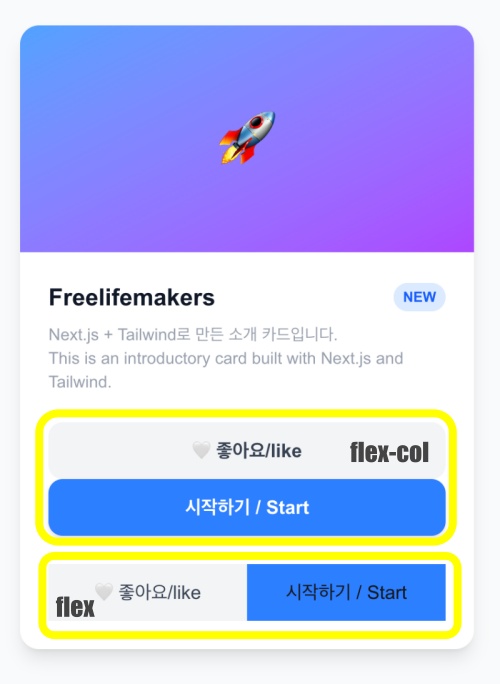
💡 flex에서 설정 값

1.flex
- 요소 가로 배치 / Horizontal element layout

2.flex-col
-  요소 세로 배치 / Vertical element arrangement

3.justify-center
- 가로 중앙 정렬 / Center-aligned horizontally

4.items-center
- 위 아래 중앙 정렬 / Vercital center alignment

5.gap-3
- 요소 사이 간격 12px / 12px spacing between elements

6.justify-between
- 요소를 양쪽 끝으로 배치 (ex. 제목은 왼쪽, 뱃지는 오른쪽)
Position elements at both ends (e.g., title on the left, badge on the right).
📁 CSS
✔️ 세로 정렬(기본 값) / Vertical alignment (default)
        <style> ...
        /* 카드 본체 / Card body */
        .card {
          width: 100%;
          max-width: 384px; /* max-w-sm = 384px */
          background-color: white;
          border-radius: 16px; /* rounded-2xl */
          box-shadow: 0 10px 15px rgba(0,0,0,0.1);
          overflow: hidden;
        } ...
        </style>
✔️ 가로정렬 / Horizontal alignment(flex)
        <style> ...
        .card-actions {
          margin-top: 24px;
          display: flex;
          gap: 12px;
        } ... ...
        </style>
✔️ 세로정렬 flex / Vertical alignment flex
        <style> ...
         .card-actions {
          display: flex;
          flex-direction: column; /* vertical */
          gap: 12px;
        } ... ...
        </style>


