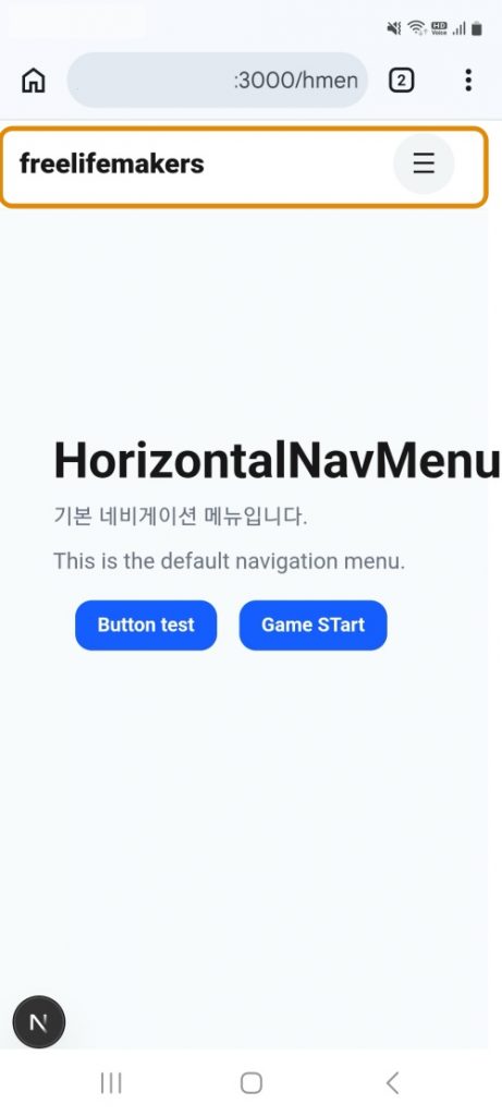
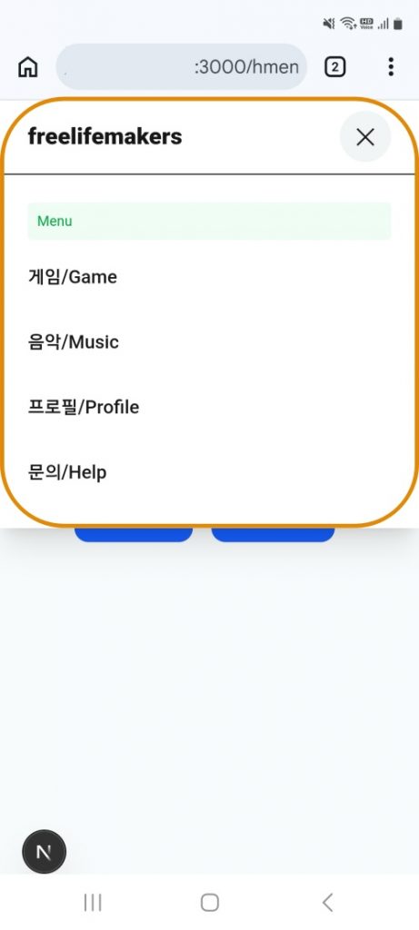
👉🏻 여기서는 웹사이트를 만들때 상단 메뉴 부분을 만듭니다.
Here, we will create the top menu section for the website.
👉🏻 여러가지 타입이 있지만 오늘은 수평 네비게이션 메뉴를 만듭니다.(Horizontal Nav Menu)
There are various types, but today we will create a horizontal navigation menu.
👉🏻 메뉴를 컴포넌트 형식으로 만들었고 tailwindcss를 사용했습니다.
I created the menu as a component and used Tailwind CSS.
👉🏻 너무 코드가 길어져서 여기서는 tailwindcss로만 진행합니다.
Since the code has become too long, I will proceed using only Tailwind CSS here.
📁 디렉토리 구조 / Directory structure
tailwindcss-nextjs/
└── app/
    ├── layout.tsx
    ├── page.tsx (루트)
    ├── globals.css
    ├── favicon.ico
    │
    ├── ui/                          ← components
    │   ├── page.tsx
    │   └── _components/
    │       ├── button.tsx           ← Button
    │       ├── dropdown.tsx
    │       └── navigation/
    │           └── HorizontalNavMenu.tsx  ← NavMenu
    │
    ├── hmenu/                       ← Menu test route
    │   ├── layout.tsx               ← layout
    │   ├── page.tsx                 ← /hmenu
    │   ├── game/ -> page.tsx        ← /hmenu/game
    │   ├── music/ -> page.tsx       ← /hmenu/music
    │   ├── profile/ -> page.tsx     ← /hmenu/profile
    │   └── help/ -> page.tsx        ← /hmenu/help
    │
    ├── button-css/ , button-tailwind/ , card-css/ ... (예제 페이지들/Example pages)
    └── form-css/ , form-tailwind/ ...
📁 아이피주소허용 / Allow IP address
✔️ next.config.ts의 코드를 아래처럼 수정합니다.
Modify the code in next.config.ts as shown below.
import type { NextConfig } from "next";

const nextConfig: NextConfig = {
  /* config options here */
 allowedDevOrigins: ['192.168.0.10', '192.168.0.*'],
};

export default nextConfig;
1)192.168.0.10은 여러분의 아이피 주소를 입력하면됩니다.
You should enter your IP address where 192.168.0.10 is shown.
2)이 부분을 수정하지 않으면 모바일 브라우저에서 http://your ip address/hmenu 이렇게 실행하면 자바스크립트가 동작하지 않습니다.
If you do not modify this part, the JavaScript will not function when you access http://your ip address/hmenu from a mobile browser.
3)위의 아이피를 허용하고 접속하면 정상적으로 모바일에서도 메뉴를 테스트 할 수 있습니다.
Once you allow the IP address mentioned above and connect, you will be able to test the menu on mobile devices as expected.
📁 메뉴 컴포넌트 / Menu Component
✔️ 메뉴는 컴포넌트 형태로 만들었습니다.
The menu was created as a component.
✔️ app/ui/_components/navigation/HoriztalNavMenu.tsx
✔️ 메뉴라벨 및 라우트
Menu Labels and Routes
const LINKS = [
  { label: '게임/Game', href: '/hmenu/game' },
  { label: '음악/Music', href: '/hmenu/music' },
  { label: '프로필/Profile', href: '/hmenu/profile' },
  { label: '문의/Help', href: '/hmenu/help' },
]
1) label은 메뉴에서 보여줄 텍스트이고 href는 실제 이동할 페이지 라우트 입니다.
‘label’ is the text to be displayed in the menu, and ‘href’ is the actual page route to navigate to.
✔️ 홈 디렉토리 링크,PC용 메뉴
Home directory link, menu for PC
        <a href="/hmenu" className="text-xl font-black">freelifemakers</a>

        {/** PC */}
        <nav className="hidden md:flex gap-6">
          {LINKS.map(l => (
            <Link
              key={l.href}
              href={l.href}
              className={`text-sm font-medium ${pathname === l.href ? 'text-black font-bold underline' : 'text-gray-600'}`}
            >
              {l.label}
            </Link>
          ))}
        </nav>
1)메뉴에서 freelifemakers를 클릭하면 홈디렉토리로 이동합니다.
Clicking “freelifemakers” in the menu will take you to the home directory.
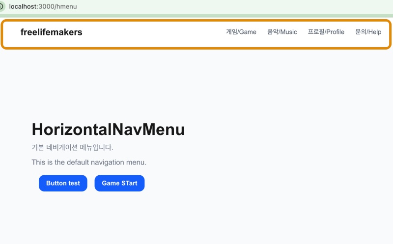
2)<nav> … </nav>의 코드는 PC에서 보여지는 메뉴입니다.
The code within <nav> … </nav> represents the menu displayed on PCs.
3) <nav className=”hidden md:flex gap-6″>
이 코드는 모바일에선 숨기고, PC(md 이상)에서만 보이도록 설정합니다.
This code is set to be hidden on mobile and visible only on PC (md size and up).
4)md는 768px md:hidden md값보다 화면이 크면 화면에 메뉴를 보여줍니다.
The md breakpoint is 768px; md:hidden means the menu will be displayed on screen whenever the screen size is larger than this md value.
✔️ 모바일용 메뉴 / Menu for mobile
    const [mobileOpen, setMobileOpen] = useState(false)
  ... ...
  <div className="flex items-center gap-3">
          <button
            type="button"
            onPointerUp={() => setMobileOpen(v => !v)} // onClick 대신 onPointerUp(모바일에 최적) / Use onPointerUp instead of onClick (optimized for mobile)
            // mobile
            className="md:hidden w-11 h-11 flex items-center justify-center rounded-full bg-gray-100 active:bg-gray-200 touch-manipulation"
          >
            <span className="text-xl">{mobileOpen ? '✕' : '☰'}</span>
          </button>
        </div>
      </div>

      {mobileOpen && (
        <div className="md:hidden absolute top-16 left-0 w-full bg-white border-t px-6 py-6 flex flex-col gap-2 shadow-xl">
          <div className="text-xs text-green-600 bg-green-50 p-2 rounded">Menu</div>
          {LINKS.map(l => (
            <Link key={l.href} href={l.href} onClick={() => setMobileOpen(false)} className="py-3 font-medium">
              {l.label}
            </Link>
          ))}
        </div>
      )}
1)md:hidden 은 md(768px)보다 화면이 크면 메뉴를 숨기고 768px보다 작아지면 보여줍니다.(모바일용)md:hidden hides the menu when the screen is larger than md (768px) and displays it when the screen is smaller than 768px (for mobile use).
2) {mobileOpen && ( … ) } 이 부분은 모바일 용으로 햄버거 메뉴를 누르면 나타나는 메뉴입니다.
The {mobileOpen && ( ... )} section represents the menu that appears when the hamburger menu is clicked on mobile devices.
3)mobileOpen의 값을 true,false로 반전시켜서 메뉴를 open,close합니다.
Toggling the value of mobileOpen between true and false opens or closes the menu.
4)메뉴 열림,닫힘 로직은 아래와 같습니다.
The logic for opening and closing the menu is as follows.
1. 변수설정 / Variable setting
const [mobileOpen, setMobileOpen] = useState(false)

2.메뉴 열림,닫힘 버튼 / Menu open/close button
<button type="button" onPointerUp={() => setMobileOpen(v => !v)} > ... </button>

3.mobileOPen의 상태에 따라 보여줄 메뉴, 링크 클릭하면 메뉴 닫기
Display the menu based on the state of `mobileOpen`; close the menu when a link is clicked.

{mobileOpen && ( ... ...

<Link key={l.href} href={l.href} onClick={() => setMobileOpen(false)}
      className="py-3 font-medium">{l.label}
</Link>
 )
📁 메뉴 적용 / Apply Menu
✔️ Layout.tsx파일에서 전체 페이지에 메뉴가 적용될 수 있도록 합니다.
In the Layout.tsx file, ensure that the menu is applied to the entire page.
import { NavMenu } from '../ui/_components/navigation/HorizontalNavMenu'

export default function HmenuLayout({ children }: { children: React.ReactNode }) {
  return (
    <>
      <NavMenu />
      <main className="min-h-screen bg-gray-50">
        <div className="mx-auto max-w-6xl px-6 py-20">
          {children}
        </div>
      </main>
    </>
  )
}
📁 메인페이지 / Main Page
✔️ 메뉴를 Layout.tsx에 적용했기때문에 여기서는 메뉴를 따로 적용하지 않습니다.
Since the menu has been applied in Layout.tsx, it is not applied separately here.
'use client'
import { Button } from '../ui/_components/button'

export default function MainPage() {
  return (
    <>
      <main className="min-h-screen bg-gray-50">
        <div className="mx-auto max-w-6xl px-6 py-20">
          <h1 className="text-4xl font-bold">HorizontalNavMenu</h1>
          <p className="text-gray-500 mt-2">기본 네비게이션 메뉴입니다.</p>
          <p className="text-gray-500 mt-2">This is the default navigation menu.</p>
          <div className="flex gap-x-4 m-4">
            <div>
            <Button onClick={() => alert('button test')} >Button test</Button>
            </div>
            <div>
            <Button onClick={() => console.log('Game Start')}>Game STart</Button>
            </div>
            </div>
        </div>
      </main>
    </>
  )
}
📁 서브페이지 / Subpage
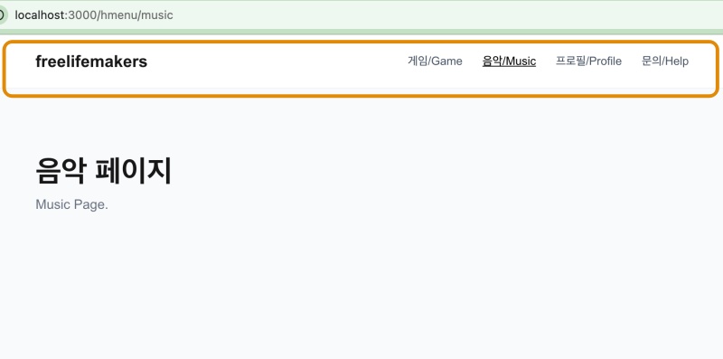
✔️ 메뉴의 서버페이지는 코드가 모두 동일합니다.
The server pages for the menu all contain identical code.
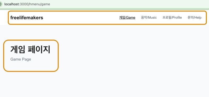
✔️ 페이지를 구별하기위한 텍스트만 다릅니다. 아래는 /game 라우트의 페이지 코드입니다.
Only the text used to distinguish the pages differs. Below is the page code for the /game route.
'use client'

export default function MainPage() {
  return (
    <>
      <h1 className="text-4xl font-bold">게임 페이지</h1>
      <p className="text-gray-500 mt-2">Game Page</p>
    </>
  )
}
📁 버튼 컴포넌트 수정 / Modify button component
✔️ 기존의 버튼 로직은 onClick등의 파라메터(Props)를 받을 수 없어서 수정했습니다.
I modified the existing button logic because it could not accept parameters (props) such as onClick.
'use client'
type ButtonProps = {
  children: React.ReactNode
  onClick?: () => void
} & React.ButtonHTMLAttributes<HTMLButtonElement>

export function Button({ children, onClick, ...props }: ButtonProps) {
  return (
    <button
      onClick={onClick}
      {...props}
      className="px-4 py-2 bg-blue-600 text-white rounded-xl text-sm font-bold
      active:bg-blue-700 touch-manipulation">
      {children}
    </button>
  )
}
📁 테스트 / Test
✔️ PC
1) 메인페이지 / Main Page
2) 서브 페이지 / Subpage
✔️ Mobile