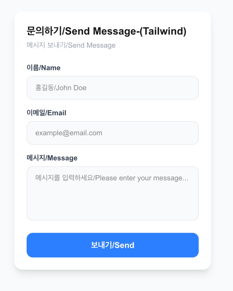
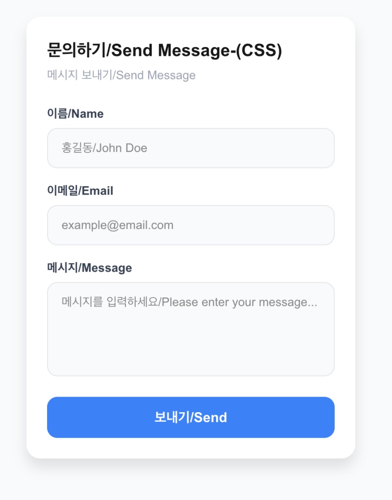
👉🏻 아래는 글쓰기 할 때 많이 사용하는 폼 부분의 UI디자인입니다.
Below is the UI design for the form section frequently used when writing.
👉🏻 tailwind는 아래의 웹사이트의 검색을 통해서 자세한 내용을 확인 할 수 있습니다.
You can find detailed information about Tailwind by searching on the website below.
✔️ npm run dev로 서버실행 후 브라우저에서 http://localhost:3000/form-tailwind 또는 http://localhost:3000/form-css 로 디자인을 확인 할 수 있습니다.
After starting the server with npm run dev, you can view the design in your browser at http://localhost:3000/form-tailwind or http://localhost:3000/form-css.
https://tailwindcss.com/docs/installation/using-vite
👉🏻 전체 코드는 깃허브에서 확인 할 수 있습니다.
You can find the full code on GitHub.
https://github.com/gideonslife01/flm-webui
📁 main
✔️ 코드 제일 윗부분으로 레이아웃과 배경색등을 설정합니다.
Configure settings such as the layout and background color at the very top of the code.
✔️ 코드 / Code
# Tailwind
<main className="min-h-screen flex items-center justify-center bg-gray-50 p-4">
... ...
</main>

# CSS
 <main className="form-page"> ... ... </main>
      <style>{`
        /* 전체 화면 가운데 / flex center */
        .form-page {
          min-height: 100vh;
          display: flex;
          align-items: center;
          justify-content: center;
          background-color: #f9fafb;
          padding: 16px;
        } ... ...
      </style>
✔️ 설명 / Description
— Tailwind
1)item-center()와 justify-center()를 사용하기 위해서 flex를 사용합니다.
Use flex to utilize item-center() and justify-center().
2)bg-gray-50은 백그라운드 컬러 p-4는 main태그 패딩을 적용합니다.bg-gray-50 applies the background color, and p-4 applies padding to the main tag.
3)min-h-screen는 최소높이로 화면 높이만큼을 적용합니다.min-h-screen sets the minimum height to the height of the screen.
— CSS
1) Tailwind와 동일한 요소는 display: flext;, align-itmes: center;justify-content : center; 입니다.
The elements equivalent to Tailwind are display: flex;, align-items: center;, and justify-content: center;.
2) CSS에서 패딩은 padding:16px, 배경색은 background-color: #f9fafb;
In CSS, the padding is padding: 16px; and the background color is background-color: #f9fafb;.
3)CSS에서 min-h-screen은 min-height: 100vh; 입니다.
In CSS, min-h-screen corresponds to min-height: 100vh;.
📁 input
✔️ 폼 요소로 이름 이메일 부분입니다.
These are the name and email form elements.
✔️ 코드 / Code
 # Tailwind
     {/* 이름 / Name Input */}
            <input
              value={form.name}
              onChange={(e) => setForm({...form, name: e.target.value})}
              placeholder="홍길동/John Doe"
              className="w-full px-4 py-3 bg-gray-50 border border-gray-200 rounded-xl text-sm focus:outline-none focus:ring-2 focus:ring-blue-500 focus:bg-white transition-all"
            />

          {/* 이메일 / Email Input */}
            <input
              type="email"
              value={form.email}
              onChange={(e) => setForm({...form, email: e.target.value})}
              placeholder="example@email.com"
              className="w-full px-4 py-3 bg-gray-50 border border-gray-200 rounded-xl text-sm focus:outline-none focus:ring-2 focus:ring-blue-500 focus:bg-white transition-all"
            />
          </div>

# CSS
       {/* 이름 / Name Input */}
              <input
                value={form.name}
                onChange={(e) => setForm({...form, name: e.target.value})}
                placeholder="홍길동/John Doe"
                className="input"
              />

       {/* 이메일 / Email Input */}
              <input
                type="email"
                value={form.email}
                onChange={(e) => setForm({...form, email: e.target.value})}
                placeholder="example@email.com"
                className="input"
              />

      <style>{` ... ...
        /* 입력칸 / input */
        .input {
          width: 100%;
          padding: 12px 16px;
          background-color: #f9fafb;
          border: 1px solid #e5e7eb;
          border-radius: 12px;
          font-size: 14px;
          outline: none;
          transition: all 0.2s;
          box-sizing: border-box;
        }
        .input:focus {
          background-color: white;
          border-color: #3b82f6;
          box-shadow: 0 0 0 2px rgba(59,130,246,0.3);
        }

    ... ... `}</style>
✔️ 설명 / Description
— Tailwind & CSS
1) 크기와 여백 / Size & Spacing
- w-full width: 100%
— 부모 너비 꽉 채우기 / Fill parent width - px-4 = padding-left: 16px; padding-right: 16px
— 좌우 안쪽 여백 / left and right inner margins - py-3 = padding-top: 12px; padding-bottom: 12px
— 위 아래 안쪽 여백 / Top and bottom inner margins
2) 색과 테두리 / Color & Border
- bg-gray-50 = background: #f9fafb
— 거의 흰색에 가까운 연한 회색 / Light gray bordering on white - border = border-width: 1px
— 테두리 켜기 / Turn on border - border-gray-200 = border-color: #e5e7eb
— 테두리 색 연한 회색 / Light gray border color - rounded-xl = border-radius: 12px
— 모서리 둥글게 / Round the corners - text-sm = font-size: 14px
— 글자 작게 / Smaller text
3) 포커스 – 글쓰기 위해서 input box를 클릭 했을 때
Focus – When clicking the input box to type
- focus:outline-none
— 클릭할 때 나오는 검은 테두리 없애기 / Remove the black border that appears when clicking - focus:ring-2
–파란색 빛나는 테두리 2px 생기기 / Add a 2px glowing blue border. - focus:ring-blue-500
— 그 빛나는 테두리 색을 파란색으로 설정 / Set the glowing border color to blue. - focus:bg-white
— 클릭하면 설정된 회색 배경색상인 회색에서 input box배경색이 흰색으로 바뀜
When clicked, the input box background color changes from the preset gray to white.
4)애니메이션 / Animation
- transition-all = transition: all 0.15s
— 색과 링이 부드럽게 전환되게 설정 / Set the color and ring to transition smoothly.
📁 textarea
✔️ 폼 요소로 글 작성 부분입니다.
This is the section for writing posts using form elements.
✔️ 코드 / Code
# Tailwind
            <textarea
              value={form.message}
              onChange={(e) => setForm({...form, message: e.target.value})}
              placeholder="메시지를 입력하세요/Please enter your message..."
              rows={4}
              className="w-full px-4 py-3 bg-gray-50 border border-gray-200 rounded-xl text-sm focus:outline-none focus:ring-2 focus:ring-blue-500 focus:bg-white transition-all resize-none"
            />

# CSS
              <textarea
                value={form.message}
                onChange={(e) => setForm({...form, message: e.target.value})}
                placeholder="메시지를 입력하세요/Please enter your message..."
                rows={4}
                className="input textarea"
              />

      <style>{` ... ...
        /* 입력칸 / input */
        .input {
          width: 100%;
          padding: 12px 16px;
          background-color: #f9fafb;
          border: 1px solid #e5e7eb;
          border-radius: 12px;
          font-size: 14px;
          outline: none;
          transition: all 0.2s;
          box-sizing: border-box;
        }
        .input:focus {
          background-color: white;
          border-color: #3b82f6;
          box-shadow: 0 0 0 2px rgba(59,130,246,0.3);
        }
        .textarea {
          resize: none;
        } ... ...
      `}</style>
✔️ 설명 / Description
— Tailwind & CSS
1)resize-none = resize: none;을 제외하곤 input 과 같습니다.resize-none is the same as input, except for resize: none;.
2)resize-none = resize: none;는 textarea의 크기를 마우스로 조절할 수 없게 잠그는 기능입니다.resize-none (or resize: none;) is a feature that locks a textarea’s size, preventing it from being adjusted with the mouse.
📁 Label
✔️ 이름,이메일 부분으로 각 요소에 텍스트 라벨을 표시합니다.
Display text labels for each element, such as “Name” and “Email.”
✔️ 코드 / Code
# Tailwind
<label className="text-sm font-bold text-gray-700">이름/Name</label>

# CSS
<label className="label">이름/Name</label>
<style>{` ... ...
        .label {
          font-size: 14px;
          font-weight: 700;
          color: #374151;
        }
... ... `}
</style>
✔️ 설명 / Description
— Tailwind & CSS
1)text-sm
font-size: 14px
2)font-bold
font-weight: 700
3. text-gray-700
color: #374151
📁 스크린 샷 / ScreenShot
요한복음 8장 32절 / John 8:32
“그리고 너희는 진리를 알게 될 것이며, 진리가 너희를 자유롭게 할 것이다.”
“Then you will know the truth ,and the truth will set you free”


