👉🏻 웹페이지를 화면에 표현하기 위해서 HTML을 사용합니다.
HTML is used to display web pages on the screen.
👉🏻 이 웹페이지를 스타일링 하기위해서는 기본적으로 css를 사용합니다.
CSS is primarily used to style this webpage.
👉🏻 웹페이지 스타일링을 하기 위해 사용하는 기본 css코드가 너무 길기 때문에 tailwindcss를 사용하면 같은 기능을 구현하기 위한 코드가 더 짧아집니다.
Standard CSS code for styling web pages can be quite lengthy, whereas using Tailwind CSS allows you to implement the same functionality with less code.
👉🏻 tailwind는 실행속도가 빠르고 다크모드등의 기능을 구현하기가 훨씬 용이합니다.
Tailwind offers fast execution speeds and makes it much easier to implement features like dark mode.
👉🏻 이 프로젝트에서는 텍스트와 간단한 버튼을 css와 tailwindcss로 구현합니다.
In this project, text and simple buttons are implemented using CSS and Tailwind CSS.
👉🏻 Nextjs프로젝트 생성은 이 포스트의 가장 아래 부분을 참조하세요
Please refer to the bottom of this post for instructions on creating a Next.js project.
📁 텍스트 / Text
✔️ tailwincss사용하려면 기본 웹페이지에 안의 HTML 태그에 tailwindcss를 다음처럼 적용합니다.
To use Tailwind CSS, apply it to the HTML tags within your web page as follows.
<p className="mt-4 text-sm text-gray-400">Next.js + Tailwind CSS</p>1) mt-4 :
— 공식문서/Official Documentation
https://tailwindcss.com/docs/margin#adding-margin-to-a-single-side
A. 컴포넌트 위쪽에 4만큼의 여백을 확보합니다.
Leave a margin of 4 above the component.
B. mt옆의 숫자는 아래의 표를 참조하세요
Please refer to the table below for the numbers next to ‘mt’.
| 클래스 / Class | rem | px |
|---|---|---|
mt-1 | 0.25rem | 4px |
mt-2 | 0.5rem | 8px |
mt-3 | 0.75rem | 12px |
mt-4 | 1rem | 16px |
mt-6 | 1.5rem | 24px |
mt-8 | 2rem | 32px |
2) text-sm :
— 관련 문서 / Official Documents
https://tailwindcss.com/docs/font-size#basic-example
A.글자크기를 14px로 설정합니다.
B.text옆의 문자는 아래의 표를 참조하세요
Please refer to the table below for the characters next to the text.
| 클래스/Class | rem | px | line-height |
|---|---|---|---|
text-xs | 0.75rem | 12px | 16px |
text-sm | 0.875rem | 14px | 20px |
text-base | 1rem | 16px | 24px – 기본값/default value |
text-lg | 1.125rem | 18px | 28px |
text-xl | 1.25rem | 20px | 28px |
3)text-gray-400 :
— 관련문서 / Official Documents
https://tailwindcss.com/docs/colors#using-color-utilities
A.글자 색은 회색으로 설정하고 진하기는 400으로 설정합니다.
Set the text color to gray and the weight to 400.
B.숫자에 부분은 아래의 설명을 참조하세요
Please refer to the explanation below regarding the numbers.
text-gray-50
 - 아주 연한 회색 / Very light gray

text-gray-200
 - 연한 회색 / Light gray

text-gray-400
 - 약간 연한 회색  / A slightly light gray - #9ca3af

text-gray-600
 - 진한 회색 / Dark gray

text-gray-900
- 아주 진한 회색 / Very dark gray
✔️ 기본 CSS에서는 위의 코드를 구현하면 아래와 같습니다.
Implementing the code above using standard CSS results in the following:
 <p className="helper">Next.js + Pure CSS</p>
     <style>{` ...
        .helper {
          margin-top: 16px;
          font-size: 14px;
          color: #9ca3af;
        }
      `}</style>
💡 공식문서는 tailwind.com의 검색을 활용하시면 됩니다.
You can find official documents by using the search function on tailwind.com.
📁 버튼 / Button
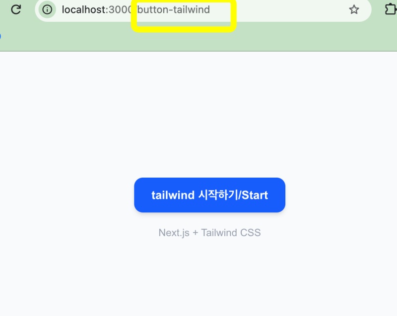
✔️ tailwindcss를 버튼에 적용하기 위한 코드는 아래와 같습니다.
The code for applying Tailwind CSS to a button is as follows.
✔️ 버튼 텍스트는 “tailwind 시작하기/Start”가 화면에 표시되고 버튼 클릭시 “클릭됨/Clicked”가 표시됩니다.
The button displays “tailwind 시작하기/Start,” and changes to “클릭됨/Clicked” when clicked.
      <button
        onClick={handleClick}
        className="px-6 py-3 bg-blue-500 text-white rounded-xl font-bold shadow-md hover:bg-blue-600 hover:-translate-y-0.5 active:scale-95 transition-all"
      >
        {clicked ? '클릭됨/Clicked 🎉' : 'tailwind 시작하기/Start'}
      </button>
1) 위의 코드에 대한 설명은 아래와 같습니다.
An explanation of the code above is provided below.
1. 크기 (여백) / Size (Margins)

px-6
- 좌우 안쪽 여백 24px (6 * 4px)
Left and right inner margins: 24px (6 × 4px)

py-3
- 위아래 안쪽 여백 12px (3 * 4px)
Top and bottom inner margins: 12px (3 × 4px)

2. 색 / Color

bg-blue-500
- 배경색 파란색 진하기 중간 정도 (#3b82f6)
Background color: blue, medium intensity.

text-white
- 글자색 흰색
Text color: white

3. 모양 / shape

rounded-xl
- 모서리 둥글게 12px
Rounded corners 12px

font-bold
- 글자 두께 700 (굵게)
Font weight 700 (Bold)

shadow-md
- 그림자 중간 크기
Medium-sized shadow

4. 상호작용 / Interaction

hover:bg-blue-600
- 마우스 올리면 배경색 더 진한 파랑으로
Change the background color to a darker blue on hover.

hover:-translate-y-0.5
- 마우스 올리면 2px 위로 살짝 뜸 (-0.5 = -2px)
Hovers up by 2px (-0.5 = -2px)

active:scale-95
- 클릭하는 순간 95% 크기로 살짝 작아짐
It shrinks slightly to 95% of its size the moment you click it.

transition-all
- 위 변화들을 부드럽게 애니메이션으로
Smoothly animate the above changes
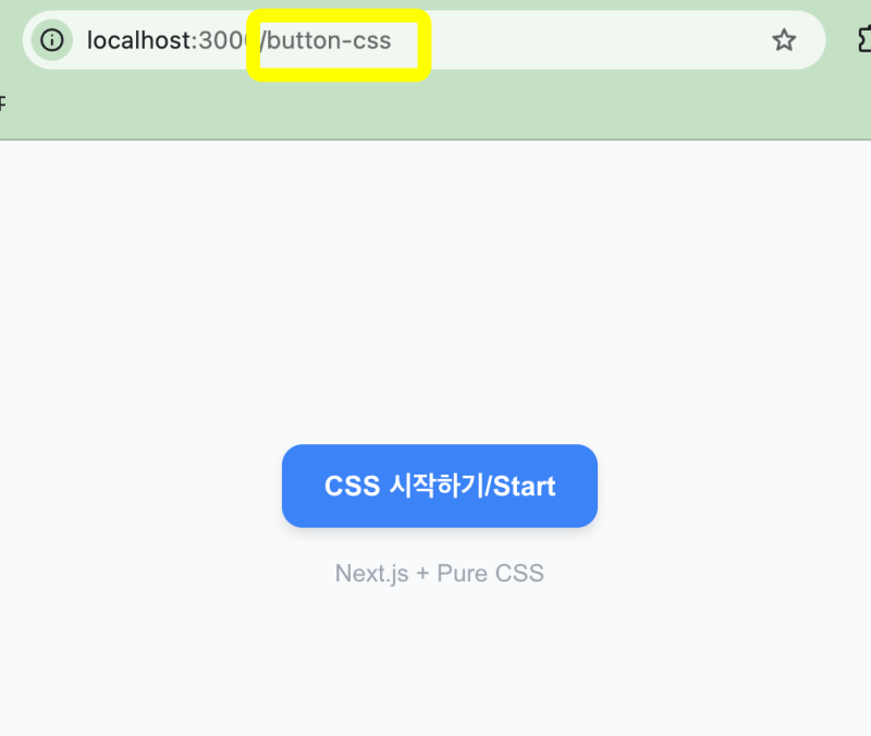
✔️ 기본 CSS에서는 위의 버튼 코드를 구현하면 아래와 같습니다.
Implementing the button code above with basic CSS results in the following.
... ...
        <button
          onClick={handleClick}
          className="btn-primary"
        >
          {clicked ? '클릭됨/Clicked 🎉' : 'CSS 시작하기/Start'}
        </button>
... ...
      <style>{`
         /* 버튼 기본 / Button Basic */
        .btn-primary {
          padding: 12px 24px;
          background-color: #3b82f6;
          color: white;
          border-radius: 12px;
          font-weight: 700;
          font-size: 16px;
          border: none;
          cursor: pointer;
          box-shadow: 0 4px 6px rgba(0,0,0,0.1);
          transition: all 0.2s ease;
        }
        /* 버튼 마우스 오버 / Button mouseover */
        .btn-primary:hover {
          background-color: #2563eb;
          transform: translateY(-2px);
          box-shadow: 0 6px 10px rgba(0,0,0,0.15);
        }
        /* 버튼 클릭 / Button active */
        .btn-primary:active {
          transform: scale(0.95);
        }
        /* 버튼 하단 텍스트 / Text below the button */
        .helper {
          margin-top: 16px;
          font-size: 14px;
          color: #9ca3af;
        }
      `}</style>
... ...
✔️ 나머지는 컨테이너 입니다.
The rest are containers.
— tailwind
<main className="min-h-screen flex flex-col items-center justify-center bg-gray-50"> ... ... </main>1)tailwind코드 설명입니다.
Here is an explanation of the Tailwind code.
1. min-h-screen
- 화면 높이만큼 최소 높이를 확보, 내용이 적어도 화면 꽉 차게.
Ensure a minimum height equal to the screen height so that the content fills the screen, even if there is little content.

2. flex
- 플렉스 모드 켜기
Turn on Flex mode

display: flex
- 자식 요소들을 유연하게 배치하는 모드. 이걸 켜야 아래 정렬 명령들 사용가능 함.
A mode for flexibly arranging child elements. You must enable this to use the alignment commands below.

3. flex-col
- 자식 컴포넌트들의 방향
Orientation of child components
- flex-direction: column
- 자식들을 세로로 쌓기 (버튼 위에 텍스트 아래 같은형식) 안 쓰면 기본은 가로(row).
If you don't specify otherwise, the default layout for children is horizontal (row); stacking them vertically (e.g., text below a button) requires a different setting.

4. items-center
- 가로(좌우) 중앙 정렬
Horizontal (left-right) center alignment
- align-items: center
- 세로로 쌓였을 때는 좌우를 가운데로 정렬
When stacked vertically, center the left and right sides.
- flex-col일 때 좌우 중앙 정렬 담당
Handles horizontal centering when using flex-col.

5. justify-center
- 세로(위아래) 중앙 정렬
Vertical (top-to-bottom) center alignment
- justify-content: center
- 세로로 쌓였을 때는 위아래를 가운데로 정렬
When stacked vertically, center the top and bottom.
- items-center + justify-center 같이 쓰면 정가운데 정렬
Use `items-center` and `justify-center` together to center-align perfectly.

6. bg-gray-50
- 배경색
background color
- background-color: #f9fafb
- 아주 연한 회색.
A very pale gray.
— css
<main className="wrapper"> ... ... </main>
 <style>{`
        /* 컨테이너 / Container */
        .wrapper {
          width: 100%;
          min-height: 100vh;
          display: flex;
          flex-direction: column;
          align-items: center;
          justify-content: center;
          background-color: #f9fafb;
        }
`}</style>
📁 Nextjs 프로젝트 생성 / Create a Next.js project
✔️ nextjs프로젝트를 터미널에서 생성합니다.
npx create-next-app@latest✔️ 아래처럼 기본값으로 Nextjs를 기본값으로 설치하면 tailwindcss가 자동으로 설치됩니다.
WebUI % npx create-next-app@latest
✔ What is your project named? … tailwindcss-nextjs
✔ Would you like to use the recommended Next.js defaults? › Yes, use recommended defaults
Creating a new Next.js app in /Users/... .../tailwindcss-nextjs.

Using npm.

Initializing project with template: app-tw


Installing dependencies:
- next
- react
- react-dom

Installing devDependencies:
- @tailwindcss/postcss
- @types/node
- @types/react
- @types/react-dom
- eslint
- eslint-config-next
- tailwindcss
- typescript
📁 테스트 / Test
✔️ tailwind button
✔️ css button
CSS
요한복음 8장 32절 / John 8:32
“그리고 너희는 진리를 알게 될 것이며, 진리가 너희를 자유롭게 할 것이다.”
“Then you will know the truth ,and the truth will set you free”


